


- Twitter Twitter link
- /
- Github Github link
- /
- LinkedIn LinkedIn link
- /
- Email Email link
- /
- Codemask Codemask link
Jacek Pudysz | Copyright © 2025 | All rights reserved
Built with Astro 🚀

Discover how to extend your React Native styles. Explore a new perspective on the StyleSheet API and learn how to create adaptive layouts.
Every React Native developer is familiar with the foundational method of creating styles – the StyleSheet API. This API is our starting point, where we use StyleSheet.create to pass an object, defining style names as keys and their corresponding CSS-like styles as values.
import React from 'react'
import { View, Text, StyleSheet } from 'react-native'

export const Example = () => (
  <View style={styles.container}>
     <Text style={styles.text}>
        StyleSheet example
     </Text>
  </View>
)

const styles = StyleSheet.create({
   container: {
      flex: 1,
      justifyContent: 'center',
      alignItems: 'center'
   },
   text: {
     fontWeight: 'bold'
   }
})
Did you know that you can remove the call to StyleSheet.create and your code will still run perfectly fine?
Well… TypeScript might complain a bit, but your View will continue to work as before, with centered Text.
import React from 'react'
import { View, Text, StyleSheet } from 'react-native'

export const Example = () => (
  <View style={styles.container}>
     <Text style={styles.text}>
        StyleSheet example
     </Text>
  </View>
)

const styles = StyleSheet.create({
const styles = {
   container: {
      flex: 1,
      justifyContent: 'center',
      alignItems: 'center'
   },
   text: {
     fontWeight: 'bold'
   }
}
})
StyleSheet.create literally does nothing, it simply returns the passed object and helps to infer the keys based on that object. You can check the source code here.
Does it mean that we don’t need to have any extension that helps use build scalable mobile apps?
Based on my experience, this is enough for most apps. You may start to encounter problems when you need to build light and dark modes, or when you need to make it responsive across different devices, from mobiles and tablets to desktops. Working with such a simple API has its benefits, but it’s not scalable for real-world projects.
Thankfully, due to the awesome React Native community, this is just the tip of the iceberg! A variety of libraries are available, each introducing new components or APIs to help you achieve more scalable and versatile styles.
Let’s quickly go through a few popular options.
The first example is the widely-used Styled Components:
import React from 'react'
import { View, Text } from 'react-native'
import styled from 'styled-components/native'

export const ExampleStyledComponents = () => (
  <Container>
     <BoldText>
        StyledComponents example
     </BoldText>
  </Container>
)

const Container = styled.View`
  flex: 1;
  align-items: center;
  justify-content: center;
`

const BoldText = styled.Text`
  font-weight: bold;
`
In the world of Styled Components, we embrace a more CSS-like syntax thanks to tagged template literals, making style writing feel natural and intuitive. The library allows for dynamic styling adaptations based on props and themes. However, it does come with a caveat – the necessity to use newly created components, leaving behind the familiar View and Text. Also passing props to such proxy-components require additional TypeScript types.
What other options do we have?
We can use NativeBase from GeekyAnts.
Actually, that was my choice in 2017 when I started to develop my first app in React Native!
import React from 'react'
import { Box, Text } from 'native-base'

export const ExampleNativeBase = () => (
  <Box
     flex={1}
     alignItems="center"
     justifyContent="center"
  >
     <Text bold>
        NativeBase example
     </Text>
  </Box>
)
With NativeBase, we encounter a cleaner and more organized landscape. The library allows for moving styling to the theme and offers a variety of different built-in components. It supports monorepos and even has its own hooks. Everything you need to get started quickly with the React Native ecosystem.
However, this means we have to use new components and can’t rely on the usual native ones we know well. It doesn’t feel like the StyleSheet API.
Anything else?
Of course, now let’s jump into Restyle from Shopify. We have a kind of similar API to NativeBase as we have a theme, breakpoints, and some predefined components:
import React from 'react'
import theme, { Theme } from './theme'

const Box = createBox<Theme>()
const Text = createText<Theme>()

export const ExampleRestyle = () => (
  <Box
     flex={1}
     alignItems="center"
     justifyContent="center"
  >
     <Text variant="bold">
        Restyle example
     </Text>
  </Box>
)
Exploring Restyle, we enter a world of flexibility. I actually like the concept presented here. The library stands out for its ability to define styles for specific device widths and comes equipped with theming and breakpoints. Exploring the library API doesn’t feel overwhelming.
import React from 'react'
import theme, { Theme } from './theme'

const Box = createBox<Theme>()
const Text = createText<Theme>()

export const ExampleRestyle = () => (
  <Box
     flex={1}
     alignItems="center"
     justifyContent="center"
     flexDirection={{
       phone: 'column',
       tablet: 'row',
     }}
  >
     <Text variant="bold">
        Restyle example
     </Text>
  </Box>
)
The trade-off?
Once again, we diverge from plain React Native components and StyleSheets. For most teams, that’s okay as we can benefit from the versatile features.
Last but not least, Tamagui welcomes us with concise syntax and a variety of components for different styling needs. While it offers an extended API, there might be a slight learning curve as developers get familiar to the new components and syntax. I feel a bit lost with the number of options, but for me, it’s still a great project with awesome features like View flattening not to mention its popularity on Twitter.
import React from 'react'
import { YStack, Text, XStack } from 'tamagui'

export const ExampleTamagui = () => (
  <XStack
     f={1}
     ai="center"
     jc="center"
  >
     <Text fontWeight="bold">
        Tamagui example
     </Text>
  </XStack>
)
Each of these libraries is a great choice for making apps in React Native. They all have special features that make them good in different ways. Whether you like being flexible, organized, or keeping things simple, there’s something for everyone. Picking any of these tools will surely help you make a strong and good-looking app just the way you want it!
What if there’s a way to retain the simplicity of the StyleSheet API while embracing a styling system that seamlessly integrates with TypeScript, themes, breakpoints, and media queries? What if there is no learning curve, hundreds of new components, or unclear API?
Sounds too good?
Stay with me as we explore a fresh take on styling for React Native and monorepos with react-native-web.
Considering the variety of library options outlined in the introduction, one might wonder if there’s room for a fresh approach that doesn’t fall short on functionalities. I believe there is. I’m going to show you a special solution that adds more to StyleSheet and uses JavaScript Proxy to help with breakpoints and working across different platforms.
This little library was created before Tamagui began supporting React Native. It wasn’t inspired by any other solution. This is my vision of a simple yet powerful API ensuring consistent styling across iOS, Android, and web platforms with a single style base.
Before we look at the code and see how it works, let’s imagine what the perfect API for such a library would be like.
After considering what we’d like the API to offer, let’s explore an example of a library. It doesn’t have an official name yet, but we can refer to it as StyleSheet 2.0. This library was designed with all those great features in mind, aiming to simplify and streamline styling for developers. Here’s a sneak peek of the minimal example:
import React from 'react'
import { View, Text } from 'react-native'
// library is not published to NPM, it resides in a local folder
import { createStyles, useStyles } from './styles'

export const ExampleStyleSheet2 = () => {
    const { styles } = useStyles(stylesheet)

    return (
        <View style={styles.container}>
            <Text style={styles.text}>
                StyleSheet 2.0 example
            </Text>
        </View>
    )
}

const stylesheet = createStyles({
    container: {
       flex: 1,
       justifyContent: 'center',
       alignItems: 'center'
    },
    text: {
       fontWeight: 'bold'
    }
})
It looks almost like the StyleSheet API. Instead of calling StyleSheet.create, we’re using a function called createStyles, and in line 7, we have a hook that does something magical with the stylesheet and returns styles.
You might be wondering, where are all the features we talked about?
Where are the dynamic functions, breakpoints, etc.?
This is just a minimal example. You don’t need to enable any feature if you don’t want to! Anyone familiar with the StyleSheet API can make this small change and unlock a world of new possibilities.
Now, it’s time to explore points 3-10 from our perfect API list. We can probably agree that points 1 and 2 are covered since we didn’t introduce any new components or new syntax like Styled Components.
How many themes does your app have?
Most likely one for light mode and another for dark mode.
How many components?
At least hundreds.
How many colors in your color palette?
Dozens.
Any custom paddings, margins?
Definitely!
Why should anyone dictate the variants, margins, padding, components, syntax, etc., that you use? Every app is unique, which is why there are no restrictions on your theme. It has no TypeScript type. Whatever you put into the theme is accessible by your styling system. There are absolutely no restrictions, and you can even include functions in your theme!
This is a valid StyleSheet 2.0 theme:
export const theme = {}That’s also a valid StyleSheet 2.0 theme:
export const theme = {
    colors: {
        blood: '#eb4d4b',
        barbie: '#e056fd',
        pumpkin: '#f0932b',
        background: '#ffffff'
    },
    components: {
        typography: {
            bold: {
                fontWeight: 'bold'
            },
            thin: {
                fontWeight: '300'
            }
        }
    },
    margins: {
        sm: 2,
        md: 4,
        lg: 8,
        xl: 12
    },
    utils: {
        hexToRGBA: (hex: string, opacity: number) => {
            const rgb = hex
                .replace('#', '')
                .split(/(?=(?:..)*$)/)
                .map(x => parseInt(x, 16))

            return `rgba(${rgb.at(0)}, ${rgb.at(1)}, ${rgb.at(2)}, ${opacity})`
        }
    }
}
Don’t like keeping typography in components?
No problem. Simply move it to the root level.
Want to introduce another structure?
Go ahead. It’s your app and your rules. Theming couldn’t be more flexible.
If you want to create a dark theme, simply create a new one, share the common logic between them, and choose different colors:
import { baseTheme } from './baseTheme'

export const darkTheme = {
    ...baseTheme,
    colors: {
        ...baseTheme.colors,
        background: '#000000'
    }
}
This flexibility ensures that you can tailor the styling to fit the unique needs and preferences of your application.
Now, how can we access the theme?
We have two options, either inject it to the createStyles or get it from useStyles:
import React from 'react'
import { View, Text } from 'react-native'
import { createStyles, useStyles } from './styles'

export const ExampleStyleSheet2 = () => {
    const { styles } = useStyles(stylesheet)
    const { styles, theme } = useStyles(stylesheet)

    return (
        <View style={styles.container}>
            <Text style={styles.text}>
                StyleSheet 2.0 example
            </Text>
        </View>
    )
}

const stylesheet = createStyles(theme => ({
const stylesheet = createStyles({
    container: {
       flex: 1,
       justifyContent: 'center',
       alignItems: 'center'
    },
    text: {
       fontWeight: 'bold'
    }
})
}))
This is a small extension, but it opens up a world of theming options:
import React from 'react'
import { View, Text } from 'react-native'
import { createStyles, useStyles } from './styles'

export const ExampleStyleSheet2 = () => {
    const { styles } = useStyles(stylesheet)

    return (
        <View style={styles.container}>
            <Text style={styles.text}>
                StyleSheet 2.0 example
            </Text>
        </View>
    )
}

const stylesheet = createStyles(theme => ({
    container: {
       flex: 1,
       justifyContent: 'center',
       alignItems: 'center',
       backgroundColor: theme.colors.background
    },
    text: {
       color: theme.components.typography.color,
       ...theme.components.typography.bold,
    }
}))
With this extension, developers can easily access and apply various theme properties, enhancing the customization and adaptability of the app’s styling.
Of course, we shouldn’t repeat ourselves with common components like containers or typography. You can create your own components for any other common tasks to keep theming consistent and organized, ensuring a cleaner and more maintainable codebase.
Still, there’s no need to import any Box, Text, or XStack. I’m not imposing any new elements on you. You have the freedom to scale your app however you see fit. This flexibility allows for a more personalized and efficient development experience.
If you’re a web developer, you’re likely familiar with media queries. They allow you to target various screens, widths, and heights to make your website pixel-perfect.
@media only screen and (min-width: 600px) {
  body {
    background-color: #e056fd;
  }
}
But how do you create media queries in React Native? We don’t have pixels - we have points. Additionally, the StyleSheet API doesn’t support writing any kind of media queries.
What if your app must support tablets or web with react-native-web?
Introducing inline media queries with StyleSheet like syntax!
You simply need to write down your conditions and the library will take care of everything:
import React from 'react'
import { Background, Typography } from './components'
import { createStyles, useStyles } from './styles'
export const ExampleStyleSheet2 = () => {
const { styles } = useStyles(stylesheet)
return (
<Background style={styles.container}>
<Typography.Bold>
Text 1
</Typography.Bold>
<Typography.Bold>
Text 2
</Typography.Bold>
</Background>
)
}
const stylesheet = createStyles(theme => ({
container: {
justifyContent: 'center',
alignItems: 'center',
flexDirection: {
':w[0, 600]': 'column',
':w[601,]': 'row',
},
backgroundColor: {
':w[0, 600]': theme.colors.blood,
':w[601,]': theme.colors.pumpkin
}
}
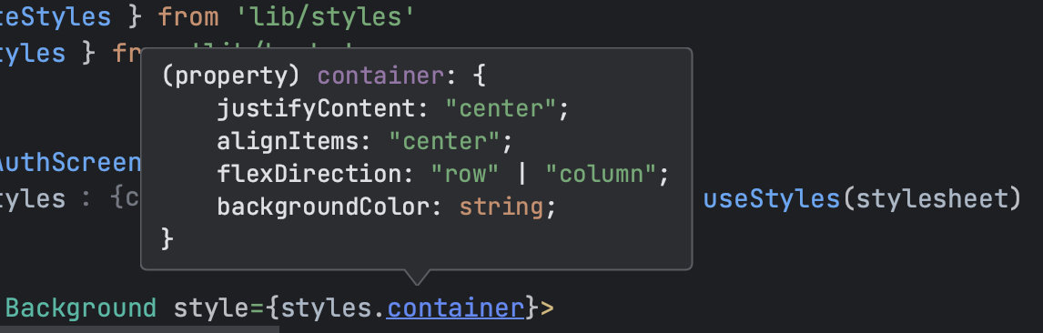
}))Did you notice lines 24-32? Instead of passing a string to flexDirection and backgroundColor we have the flexibility to pass objects with our media-queries.
Here is a demo:
The syntax is super easy!
You can either create a closed range, like in line 25, where I set a range from 0 to 600 points (for mobile) or 0 to 600 px (for web) or skip it in the opening or closing range:
:w[200] - min 200 (pt or px)
:w[200, 500] - from 200 to 500 (pt or px)
:h[400, 700] - same goes for height, from 400 to 700 (pt or px)

:w[,300] from 0 to 300 (pt or px)
:h[200,] from 200 to infinity (pt or px)
You can also combine both width and height:
:w[200, 500]:h[800, 1200] - both with and height
The best part? The TypeScript type, which looks as follows:
Everything is inferred and flattened to satisfy React Native! This means you get the benefit of type safety and autocompletion, making your development process smoother and more efficient.
But that’s not all.
In a typical mobile app development process, we have designs prepared by a team of designers. If the client wants to support tablets or the web, it’s also included in the designs. It would be tedious to specify pixel (or point) perfect media queries. Most likely, in 95% of cases, we will use predefined breakpoints like sm, md, lg, etc., and for the remaining cases, we will adjust with additional media queries.
No worries, I’ve got you covered!
You can define your breakpoints however you want. You can even introduce different names like superLarge, tvLike etc.
Simply create a file and put whatever you want to the object:
export const breakpoints = {
    xs: 0,
    sm: 576,
    md: 768,
    lg: 992,
    xl: 1200,
    superLarge: 2000,
    tvLike: 4000
}
There are no restrictions on names and values. You don’t even need to keep them in sorted order.
Now, you can replace your media queries with breakpoints:
import React from 'react'
import { Background, Typography } from './components'
import { createStyles, useStyles } from './styles'

export const ExampleStyleSheet2 = () => {
    const { styles } = useStyles(stylesheet)

    return (
        <Background style={styles.container}>
            <Typography.Bold>
                Text 1
            </Typography.Bold>
            <Typography.Bold>
                Text 2
            </Typography.Bold>
        </Background>
    )
}

const stylesheet = createStyles(theme => ({
    container: {
       justifyContent: 'center',
       alignItems: 'center',
       flexDirection: {
          xs: 'column',
          sm: 'row',
       },
       backgroundColor: {
          xs: theme.colors.blood,
          ':w[601,]': theme.colors.pumpkin
       }
    }
}))
You can also mix breakpoints with media queries. In this case, media queries always have higher priority. If your media query overlaps with breakpoints, a style will be picked based on the media query.
What about the TypeScript type? It looks exactly the same as before.
We still have a few more points to cover, but in my view, points 6 to 9 are also addressed.
- It should follow the StyleSheet API approach - define one object below your component, and use it with styles.key in your JSX
That’s precisely what we did in the demo above. As a developer, you can access all your styles with the same API that StyleSheet produces.
- It should offer precise TypeScript hints
Not only does it infer and flatten your styles, but it also provides the same hints that the StyleSheet API offers.
For the following styles:
const stylesheet = createStyles(theme => ({
    container: {
       justifyContent: 'center',
       alignItems: 'center',
       flexDirection: {
          xs: 'column',
          sm: 'row',
       },
       backgroundColor: {
          xs: theme.colors.blood,
          ':w[601,]': theme.colors.pumpkin
       }
    },
    text: {
        fontWeight: {
            xs: 'bold',
            sm: '200'
        }
    },
    button: {
        backgroundColor: theme.colors.barbie
    }
}))
You can get precise hints:
There are also hints for your theme, breakpoints and styles inside createStyles.
- It should be cross-platform
The library only requires React Native. If you want to use it with expo or react-native-web and target browsers, it will just work. There are no external dependencies.
- It should be compact, just a few TypeScript files
Currently, the library consists of 5 files containing around ~400 lines of code (excluding tests).
You’ve just seen a powerful API, and you might be wondering how you can register your theme or breakpoints. That’s also easy. You can register your theme with just one provider. Remember, you can pass anything here!
Keep in mind that ThemeProvider is optional. If you don’t want to inject anything then you can skip this step:
import React, { useState } from 'react'
import { AppRouter } from 'lib/routing'
import { ThemeProvider } from './styles'

export const App = () => {
    // obtain here your dark or light theme. It can be storage, state or simply import if from file
    // const [yourAppTheme] = useState(lightTheme)
    // const [yourAppTheme] = useYourStorage()
    // import { yourAppTheme } from './theme'

    return (
        <ThemeProvider value={yourAppTheme}>
            <AppRouter />
        </ThemeProvider>
    )
}
Now, to use createStyles and useStyles obtain them through a factory createTheme exported from the library:
// import your breakpoints, add whatever keys and numeric values you want
import { breakpoints } from './breakpoints'
// import your app's theme TypeScript type, or simply use 'typeof theme'
import { AppTheme } from './theme'
// import library factory
import { createTheme } from './styles'

export const {
    createStyles,
    useStyles,
} = createTheme<typeof breakpoints, AppTheme>(breakpoints)
That’s all. Just a few lines of code.
There is one more thing. I refer to it as dynamic styling function.
There is one cherry on top. The library is also open to receiving values from your JSX.
Let’s imagine that you have a list of posts.
How would you go about adding a different style to even and odd elements?
import React from 'react'
import { ScrollView, Text, View } from 'react-native'
import { createStyles, useStyles } from './styles'

type Post = {
    title: string,
    key: string
}

const posts: Array<Post> = [
    {
        title: 'Styled Components',
        key: '1',
    },
    {
        title: 'Native Base',
        key: '2',
    },
    {
        title: 'Restyle',
        key: '3',
    },
    {
        title: 'Tamagui',
        key: '4',
    },
    {
        title: 'StyleSheet 2.0',
        key: '5',
    },
]

export const ExampleStyleSheet2 = () => {
    const { styles } = useStyles(stylesheet)

    return (
        <ScrollView contentContainerStyle={styles.scrollContainer}>
            {posts.map(post => (
                <View key={post.key}>
                    <Text>
                        {post.title}
                    </Text>
                </View>
            ))}
        </ScrollView>
    )
}

const stylesheet = createStyles({
    scrollContainer: {
        flex: 1,
        justifyContent: 'center',
        alignItems: 'center',
    },
})
You can create two styles:
export const ExampleStyleSheet2 = () => {
    const { styles } = useStyles(stylesheet)

    return (
        <ScrollView contentContainerStyle={styles.scrollContainer}>
            {posts.map((post, index) => (
                <View
                    key={post.key}
                    style={index % 2 === 0 ? styles.even : styles.odd}
                >
                    <Text>
                        {post.title}
                    </Text>
                </View>
            ))}
        </ScrollView>
    )
}

const stylesheet = createStyles({
    scrollContainer: {
        flex: 1,
        justifyContent: 'center',
        alignItems: 'center',
    },
    even: {
        backgroundColor: 'gold',
    },
    odd: {
        backgroundColor: 'silver',
    }
})
Or you can convert it to dynamic styling function:
export const ExampleStyleSheet2 = () => {
    const { styles } = useStyles(stylesheet)

    return (
        <ScrollView contentContainerStyle={styles.scrollContainer}>
            {posts.map((post, index) => (
                <View
                    key={post.key}
                    style={styles.post(index)}
                >
                    <Text>
                        {post.title}
                    </Text>
                </View>
            ))}
        </ScrollView>
    )
}

const stylesheet = createStyles({
    scrollContainer: {
        flex: 1,
        justifyContent: 'center',
        alignItems: 'center',
    },
    post: (index: number) => ({
        backgroundColor: index % 2 === 0 ? 'gold' : 'silver',
    })
})
There are no limits and you can still combine these functions with media queries and breakpoints.
What do you think? Does it fulfill our dream API list?
Is it flexible enough for you?
You might be wondering what the code of the library looks like. It’s TypeScript-heavy, with multiple levels of inferring types. The library is not yet published because I need to write more tests, and I’m definitely going to need more testers (like you) to move it from beta to a stable 1.0.
If you’re interested in getting this library as soon as possible, reach out to me on Twitter. Make some noise there, so I will speed up the release!
Here are a few types that power the library:
type StyleProperty<T, B extends Record<string, number>> = {
    [key in keyof T]?: {
        [innerKey in keyof B]?: T[key]
    } | {
        [innerKey in `:w${string}` | `:h${string}`]?: T[key]
    } | T[key]
}

export type CustomNamedStyles<T, B extends Record<string, number>> = {
    [P in keyof T]:
    | ViewStyle
    | TextStyle
    | ImageStyle
    | TransformsStyle
    | CSSProperties
    | StyleProperty<ViewStyle, B>
    | StyleProperty<ImageStyle, B>
    | StyleProperty<TextStyle, B>
    | (
        (...args: Array<never>) => ViewStyle | TextStyle | ImageStyle | TransformsStyle | CSSProperties | StyleProperty<ViewStyle, B> | StyleProperty<ImageStyle, B> | StyleProperty<TextStyle, B>
    )
}
It took me days to figure it out and make it compatible with existing React Native projects. TypeScript doesn’t forgive!
I would like to focus on the usage of Proxy mentioned in the introduction. I’m using it to pick the correct breakpoint while resizing the browser and using the dynamic styling function. Keep in mind that this function is triggered while the component is rendered, so I can’t pick up the breakpoint upfront.
What if the user is doing some kind of calculation based on passed arguments?
Here is a utility function that proxifies the style to lazy-load it’s computation:
export const proxifyFunction = <B extends Record<string, number>>(fn: Function, breakpoint: keyof B & string, screenSize: ScreenSize, breakpoints: B) => {
    const stringifiedFunction = fn.toString()
    const hasCustomMediaQuery = stringifiedFunction.includes(':w') || stringifiedFunction.includes(':h')
    const hasBreakpoint = Object
        .keys(breakpoints)
        .some(bp => stringifiedFunction.includes(bp))

    if (!hasCustomMediaQuery && !hasBreakpoint) {
        return fn
    }

    return new Proxy(fn, {
        apply: (target, thisArg, argumentsList) =>
            parseStyle(target.apply(thisArg, argumentsList), breakpoint, screenSize, breakpoints),
    })
}
There are more such a cool features, and I put my heart in designing this library. I’m also looking for your input and improving it even further to truly call it StyleSheet 2.0.
Let’s explore a real-world demo where your client wants to create an app for both phone and web. With StyleSheet 2.0 a side effect will be automatic support for tablets.
I hope I’ve piqued your interest, especially if you’ve encountered challenges with other styling libraries that enforce new components, theme structures, predefined breakpoints and thick documentations.
These may work for your use case, but at Codemask, we prefer to design & build an app from the ground up. Each app is unique and shouldn’t rely on predefined styles. We craft every color, component variant, and size into a tailor-made theme. The theme for every app differs, that’s what makes it unique.
I’m excited to share the beta version with you soon. If you want to stay up to date, click subscribe, and I will send you a newsletter email with the link to the repository.
In the meantime, happy hacking!
Jacek Pudysz | Copyright © 2025 | All rights reserved
Built with Astro 🚀